
Gantt chart basics: How to read a Gantt chart in 9 easy steps

Let’s say you open a project plan and you see horizontal bars stretching across a calendar, color-coded rows, dotted lines connecting tasks, and diamond shapes scattered throughout. If you don’t already know what you’re looking at, it might seem incredibly confusing.
This Gantt chart guide walks you through how to read each symbol and sign (without needing a project management degree).
By the end, you’ll know what each task bar, dependency line, and milestone symbol actually means, what to check when you first open a new chart, and how to tell whether a project is on track without asking anyone to explain it to you. Whether you’re staring at a simple Gantt chart for a three-task sprint or a complex project spanning multiple teams and phases, we can help.
Want a Gantt chart tool that’s easy to read from day one?
How to read a Gantt chart step by step
Reading a Gantt chart gets easier once you have a consistent sequence. Follow these steps every time you open one, whether it’s a visual timeline for a construction project, a software development sprint, or a company-wide initiative.
1. Read the task list (vertical axis) first
The left-hand column is your task list, the spine of the entire project. Each row represents a task or a group of related tasks. Read top to bottom to understand the project scope and structure before you even glance at the timeline. Jumping straight to the bars is the number one reading mistake most people make.
2. Orient yourself on the timeline (horizontal axis)

The horizontal axis running along the top is your project schedule laid out as a calendar, measured in days, weeks, or months, depending on the project’s scale. Find today’s date (the red vertical line in the example above).
Everything to the left has started or finished. Everything to the right is upcoming. This single step reframes everything else you’re about to read.
3. Understand what the bars represent
Each bar maps directly to a task on the vertical axis. The bar’s left edge is the start date, the right edge is the end date, and the length tells you the task duration. A longer bar means a longer task, not a harder one, nor a more important one. Just longer.
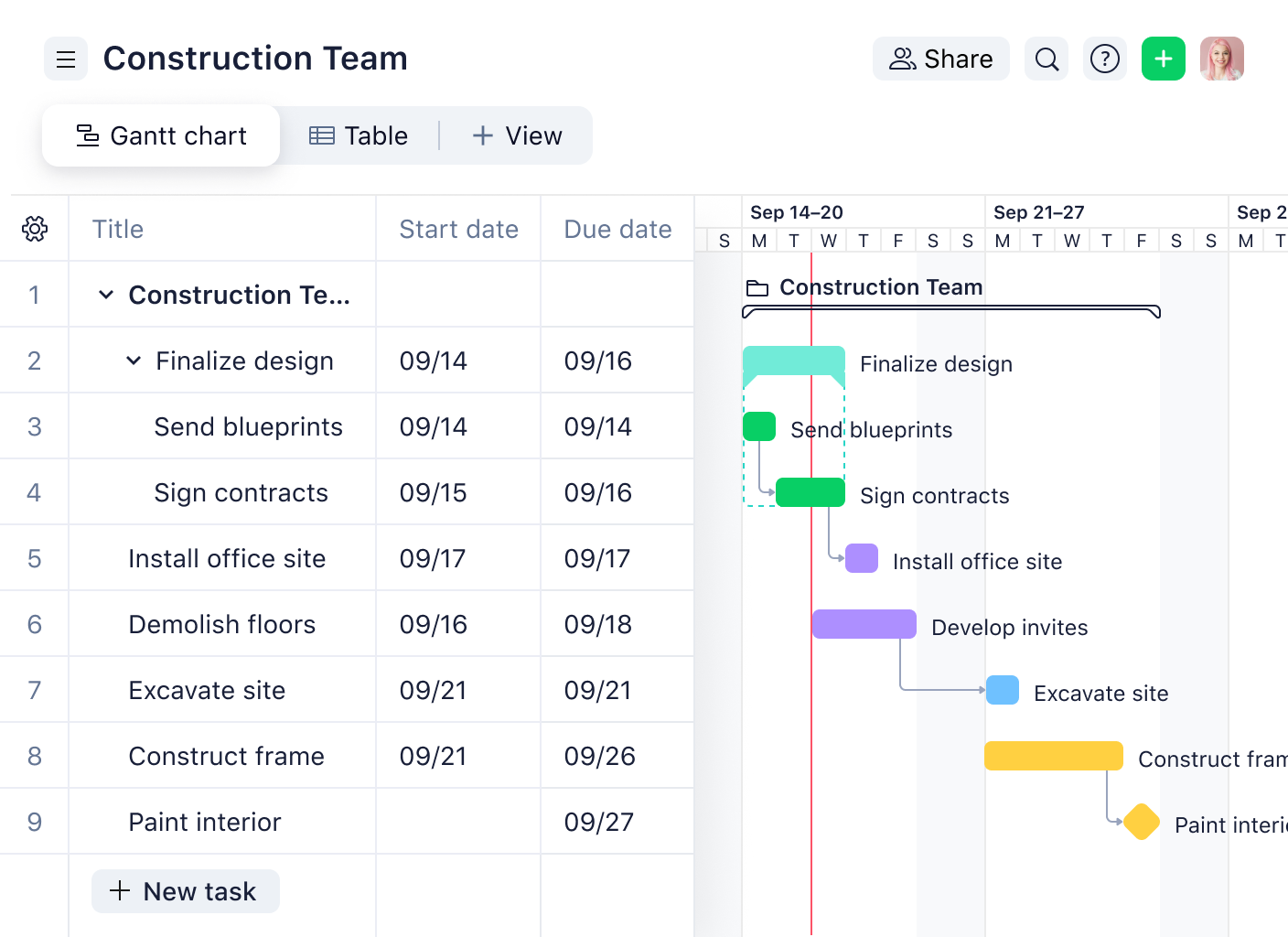
Let’s look at the example above for a construction project. Demolishing the floors (in purple) is going to take longer than excavating the site (blue), but that doesn’t mean excavating the site is easier; it only means the floor demo will take longer to complete.
4. Check the fill or progress indicator
Some Gantt chart software shows a darker fill or inner bar running inside the main bar to reflect task progress. If a bar is 75% filled and today’s date lines up with the 75% mark on the horizontal axis, that task is on schedule. If today is past that point and the fill hasn’t caught up, something’s slipping.
5. Follow the arrows or lines between bars
These are task dependencies, and they’re where schedule risk actually lives. An arrow from task A to task B means task B can’t start until task A is done. A delay in one dependent task affects everything downstream. Trace the dependency lines before you draw any conclusions about overall project progress.
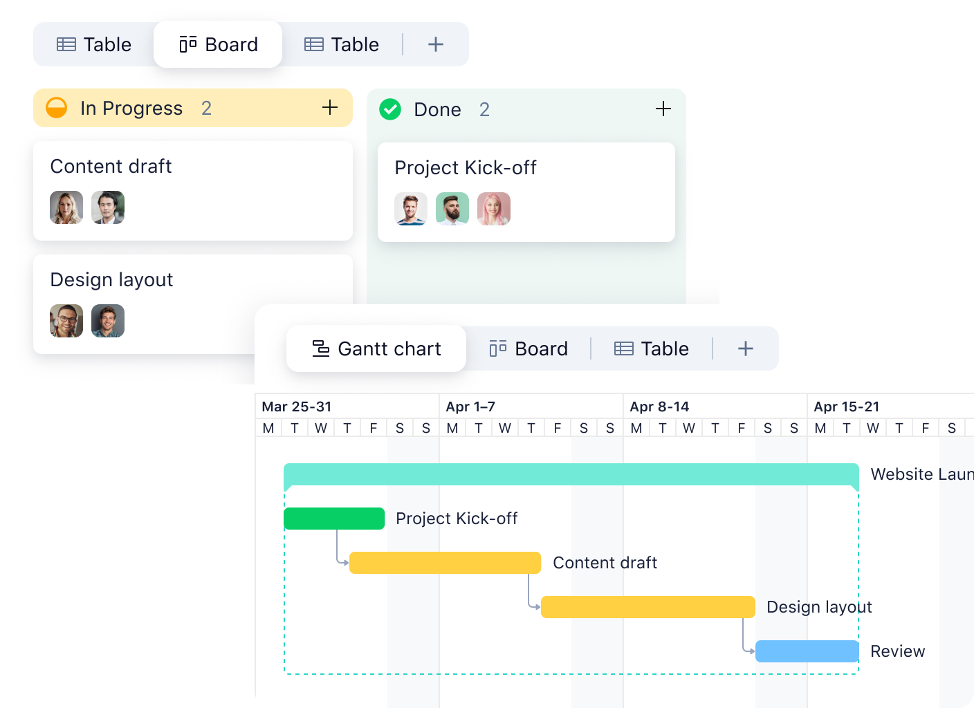
If you look at the example above, we can see the design layout can’t start until after the content draft is complete. The arrows between the two tasks indicate that the design layout is dependent on the content draft finishing first.
6. Look for diamonds on the timeline
Diamonds mark milestones, which are fixed points on the horizontal axis that represent key dates, deliverables, or decisions. They have no duration and don’t stretch across the timeline. They sit at a single point and signal that something important happens here.
7. Find the critical path if it’s marked
Some Gantt chart tools highlight the critical path, which is the sequence of tasks where any delay pushes the project completion date. If a task sits on the critical path and it’s behind, that’s your priority — everything else has some float.
8. Check for a baseline
A baseline appears as a secondary bar running alongside the main one on the horizontal axis. It represents the original project plan, with the start and end dates as agreed before work began. Comparing it to the current bar shows whether the project has drifted and by how much.
9. Use the legend
Read this before drawing conclusions from colors. What’s red in one team’s Gantt chart might mean “on hold” while in another it means “high priority.” Never assume. Check the legend first.
Example: Reading a simple Gantt chart
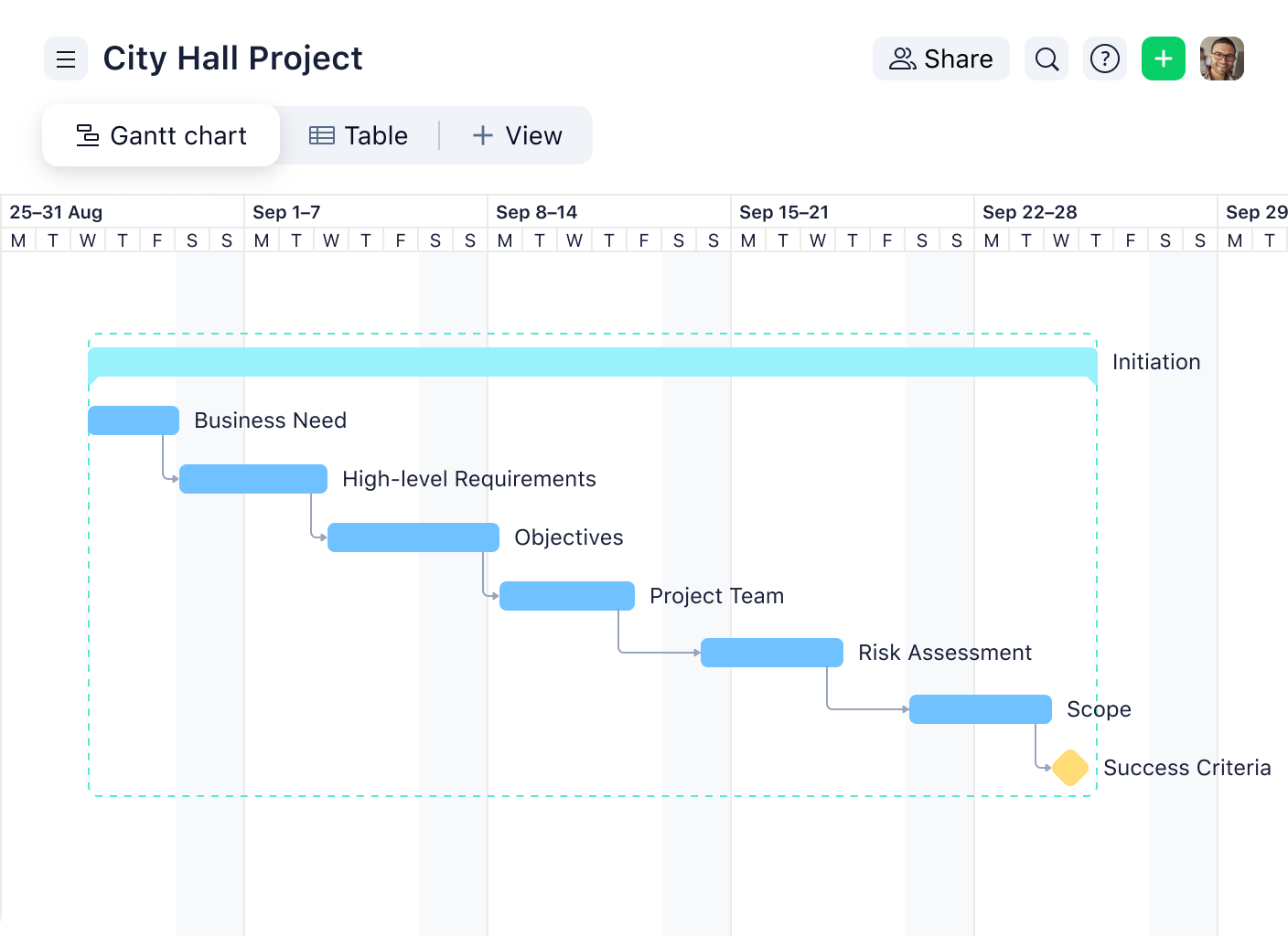
Take the “City Hall Project” above. It’s running from late August through late September.
Start with the vertical axis: The task list runs top to bottom: Business Need, High-level Requirements, Objectives, Project Team, Risk Assessment, Scope, and Success Criteria. The sequence tells you the story before you look at the timeline.
Check the horizontal axis: The timeline runs in weekly bands from August 25 through late September. Each task bar sits inside that calendar, so you can immediately see when work starts and how long it runs.
Follow the dependency arrows: Every task is connected by a finish-to-start arrow. If Business Need had slipped by three days, every task below it would have shifted right by three days too.
Spot the milestone: Success Criteria is marked with a gold diamond, not a bar. It’s the fixed endpoint of the Initiation phase, the moment everything above it has to be completed before the project moves forward.
Common mistakes to avoid
You can follow every step above and still walk away with the wrong picture. Gantt charts are intuitive once you know the rules, but a few assumptions trip up even experienced project managers. Here’s where most people go wrong.
Assuming a long bar means an important task: Bar length reflects duration, not priority. When you use a Gantt chart to plan projects, a two-week bar might be a low-effort waiting period, while a one-day bar might be the most critical handoff in the project.
Reading left-to-right without anchoring to today: Without finding the current date first, you can’t distinguish what’s late from what’s future. This is especially easy to miss in online Gantt chart software, where the default view might not center on today’s date.
Ignoring task dependencies: In complex projects with lots of dependent tasks, a task that looks fine on its own might be blocking five others. Always follow the arrows before drawing conclusions.
Treating percentage complete as time complete: A task marked 50% done means half the work is done, not that half the time has elapsed. Actual progress and elapsed time diverge constantly, especially in software development and creative projects.
Confusing summary bars with individual tasks: Summary tasks group related work and appear as larger capped bars spanning multiple rows. They’re containers, not single pieces of work, so don’t assign a project phase status based on the summary bar alone.
Skipping resource allocation columns: Some Gantt chart software includes resource or task-owner columns. A bar that’s behind might simply mean the task owner is overloaded elsewhere, which might require a major resourcing shift.
Put what you’ve learned to work
A Gantt chart is only useful if you can read it quickly and trust what it's showing you. That comes down to two things: knowing the elements (which you now do), and using a tool that doesn’t make you fight to see them.
Wrike's Gantt chart view keeps dependencies, milestones, and task progress visible without digging. You can drag to reschedule tasks, see how a change ripples through the timeline, and share a live view with your team instead of exporting a static file that’s outdated an hour later.
If your current setup requires a meeting to explain what the chart is telling you, that’s a problem worth fixing.
FAQs
Find today’s date on the horizontal axis and check whether the progress fill inside each active task bar has kept pace with it. If the fill is behind where today falls on the bar, that task is running late.
It tells you the planned task duration. A longer bar means the task takes more time, not that it’s more important or complex.
They show task dependencies, meaning one task must finish before the next can begin. A delay in an upstream task automatically pushes back every dependent task connected to it.
Look for a sequence of tasks highlighted in a distinct color, usually red. Any delay on the critical path extends the project’s end date, so these tasks get priority over everything else.
A baseline is a snapshot of the original project plan, shown as a secondary bar alongside the current one. Comparing the two tells you how far the project has drifted from what was initially agreed.
Focus on structure first: task names, bar lengths, dependency arrows, and progress fills will tell you most of what you need. For color meaning, look for patterns or ask the chart’s owner directly, since color conventions vary across Gantt chart tools and teams.