
- What is a PERT chart? This is a visual tool in project management that maps tasks and schedules using Program Evaluation Review Technique (PERT).
- How do PERT charts differ from critical path diagrams? PERT uses three duration estimates (best, worst, average), while critical path uses a single estimate for each task.
- What are the main advantages of PERT charts? They clearly depict task dependencies, provide more accurate estimates, and highlight critical paths.
- What are some disadvantages of PERT charts? They can be complicated to create, difficult to update, and estimates may be inaccurate if poorly done.
- How can PERT charts be enhanced? Utilize project management software like Wrike to leverage historical data for better duration estimates.
In project management, there are a number of tools and techniques that can be used to plan, schedule, and coordinate tasks and resources. One of those tools is a PERT chart. But what is a PERT chart exactly and how does it help simplify complex projects?
This article will provide a thorough walkthrough of PERT charts within project management, including a comprehensive PERT chart definition, an overview of PERT chart advantages, disadvantages, and tips on how best to use a PERT chart for your next project.
What is a PERT chart?
A PERT chart is one of the more specialized types of project management charts useful for mapping out project tasks and planning the overall schedule.
Many people confuse PERT with PERT chart, so the best way to provide a comprehensive PERT chart definition is to start with clarifying both of these terms.
PERT stands for Program Evaluation Review Technique. PERT is the actual technique that is used to create a PERT chart. Meanwhile, a PERT chart is the visual diagram that results from using PERT. Think of PERT as the process and the PERT chart as the outcome.
PERT charts allow project managers to see essential scheduling details such as task dependencies, task duration estimates, and the minimum amount of time a project can be completed within. But, they’re not the most user-friendly or well-understood tool.
What is the difference between a PERT chart and a critical path diagram?
PERT and critical path method are both scheduling techniques a project manager can use to view task dependencies and estimate project durations. Visually, the two diagrams look a lot alike as they are both network diagrams.
The major difference is in the numbers used for estimating. Critical path diagrams use one number for each task duration, whereas PERT diagrams use three: best case, worst case, and most likely. The use of three numbers results in multiple potential project durations shown on PERT charts.
What is the difference between a PERT chart and a Gantt chart?
Gantt charts are a popular tool for visualizing project schedules. They’re a type of bar chart that also shows task dependencies and project timelines.
Gantt charts tend to be less technical and easier for viewers to understand as they don’t include the same level of detail as PERT charts.
For this reason, PERT charts tend to be better for initially estimating project timelines, while Gantt charts are often preferred for team project time tracking and keeping stakeholders up-to-date during the project.
To better understand the differences between the two, check out our article on PERT charts vs. Gantt charts.
What is an example of a PERT chart?
Here is a PERT chart example:
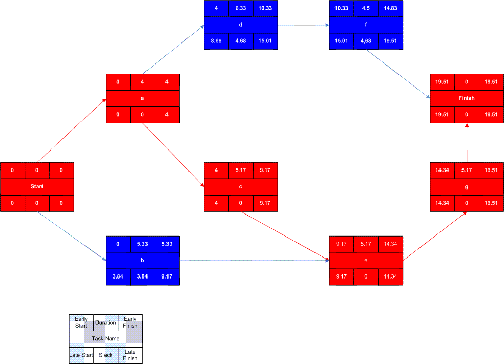
Each box represents a project activity or task. Within each box, there are seven sections, each showing a different piece of information about the task:
- The rectangular box in the middle shows the task number or name.
- The top left box indicates Early Start (ES), the earliest the task can begin.
- The top middle box is the task duration, found using the PERT technique.
- The top right box indicates Early Finish (EF), the earliest the task can end.
- The bottom right box shows Late Finish (LF), the latest a task can finish.
- The bottom middle box is the slack, the amount of time the task can slip without changing the project end date.
- The bottom left box shows Late Start (LS), the latest a task can start.
How do you use a PERT chart in project management?
By calculating all the numbers shown in a PERT chart, you can identify the total expected project length, which tasks are on the critical path, and how much slack each task has.
This information allows you to estimate project duration and prioritize tasks based on whether they can afford to be delayed without pushing the entire schedule out. The importance of the project being completed on time is crucial here, and all other parts of the project should factor into that goal.
To use a PERT chart in project management, follow these steps:
- Start by listing out all of the tasks required for your project.
- Note any dependencies between activities.
- Make a table with six columns:
- Task name or number
- Predecessor (Name or number of task that needs to happen before an activity can begin)
- Optimistic/ best case duration estimate
- Average task duration estimate
- Worst case/ pessimistic duration estimate
- Expected time
- Estimate best, worst, and average durations for each task.
- Use this formula to populate expected times: (Best case + (4 x average) + worst case) / 6
- Use a PERT chart template to start populating the actual diagram. Work from left to right, filling in the task names in order based on predecessors.
- Use the expected times you calculated to input duration.
- Your Starting task will have an Early Start (ES) of 0 as it’s the beginning. Early Finish (EF) should equal ES + duration.
- The next task’s ES will equal the predecessor’s EF. Work left to right, populating these two boxes for every task.
- If a box has two or more predecessors connected to it, it’s ES is the latest of the EFs connected to it. (I.e., If Task A has an EF of 2 and Task B has an EF of 4, and both need to be completed before Task C can start, then the earliest Task C can start is 4.)
- Once you reach the final task, it’s EF becomes it’s LF (Late Finish) — this is the longest you want the project to take.
- Now work backward, from right to left, to calculate the LFs and LSs (Late Starts).
- Begin with the last LF you just populated and subtract duration to get the task’s LS.
- Then use that LS as the LF of the task directly preceding it.
- The final number you calculate is Slack. Slack = LF – EF. This shows how much time a task can slip from its planned start date without your overall schedule being delayed.
- Tasks that have Slack = 0 are on the critical path. You can highlight these in another color to help them stand out.
What are the advantages and disadvantages of PERT charts?
PERT chart advantages include:
- Highlighting task dependencies and your critical path.
- More accurate estimates than when relying on single task duration estimates.
- Easy to see how long non-critical tasks can be delayed without impacting the project end date.
PERT chart disadvantages include:
- Durations are still based on estimates. If you did a poor job coming up with your numbers, this method won’t be any more accurate than the critical path method.
- PERT charts can be time-consuming and difficult to create and update.
- They can be confusing for stakeholders to interpret.
- PERT assumes one task must end before the next starts. Other types of dependency relationships won’t work well with this technique.
Improve your PERT charts with Wrike
Wrike project management software allows you to easily track and record all of your task and project durations in one central location. So, when it’s time to create your estimates for your next PERT chart, you can use actual historical data to populate the best, worst, and most likely task durations.
You’ll also be able to see what changes occurred and who worked on the tasks and projects, so you know who to speak to if you need more help estimating timelines. Start your free trial of Wrike now and discover how it will help you create more accurate project timelines.