One platform to align strategy with execution for end‑to‑end success
Key takeaways:
What are dashboard templates? Dashboard templates are pre-designed frameworks that visually represent data using charts, graphs, tables, and gauges, allowing users to quickly assess performance and analyze data.
How can I customize dashboard templates? Users can personalize visualizations by adjusting colors, fonts, and layouts to align with brand identity and enhance user engagement.
What components make up a dashboard template? Key components include charts and graphs, key metrics, filters, data tables, and alerts, facilitating quick insights and detailed analysis.
What are the types of dashboard templates? Types include operational, analytical, and strategic templates, each tailored for specific uses like real-time monitoring, in-depth analysis, or high-level strategic planning.
How do I choose the right dashboard template? Assess your data analysis needs, compare template features, and ensure customization options match your specific analysis goals for optimal effectiveness.
The ability to analyze and interpret large amounts of data is crucial for making informed decisions. Dashboard templates have emerged as powerful tools that enable organizations to visualize and understand complex data sets effectively. This article explores the various aspects of dashboard templates, from their definition to their customization options. By the end, you will have a comprehensive understanding of how these templates can enhance your data analysis capabilities.
Understanding Dashboard Templates
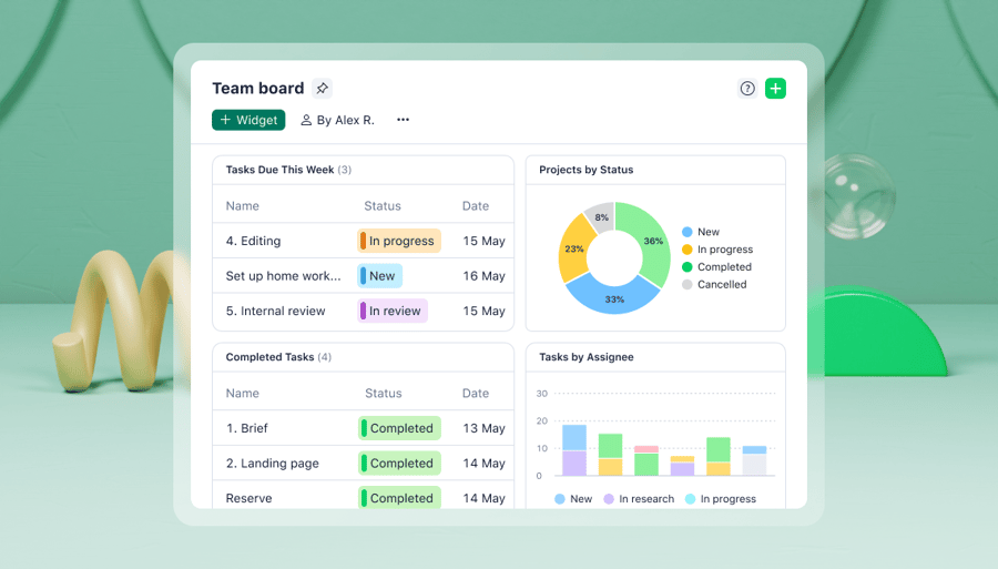
Dashboard templates are pre-designed frameworks that provide a visual representation of data. They are essentially a collection of data visualization components, such as charts, graphs, tables, and gauges, that are organized in a visually appealing and user-friendly manner. They enable users to quickly grasp the overall performance of their business or analyze specific aspects of their data. These templates are flexible and adaptable, allowing users to customize them according to their specific requirements.
When it comes to data visualization, dashboard templates offer a wide range of options to choose from. Users can select the most suitable charts or graphs to represent their data accurately and effectively. Whether it’s a line chart to show the trend over time, a bar graph to compare different categories, or a pie chart to illustrate proportions, dashboard templates provide the necessary tools for visualizing data in a meaningful way.
The Importance of Dashboard Templates in Data Analysis
One of the key advantages of using dashboard templates in data analysis is the ability to customize and personalize the visualizations. Users can choose different color schemes, fonts, and layouts to match their brand identity or personal preferences. This level of customization not only adds a touch of uniqueness to the dashboards but also helps in creating a more engaging and visually appealing user experience.
Moreover, dashboard templates often come with interactive features that allow users to drill down into the data for deeper insights. By clicking on specific data points or filtering the data based on certain criteria, users can uncover hidden patterns or relationships that may not be apparent at first glance. This interactivity enhances the analytical capabilities of the templates and empowers users to extract valuable insights from their data.
When it comes to a dashboard template, there is more than meets the eye. While it may seem like a simple collection of charts and graphs, there is a whole world of functionality and design that goes into creating a truly effective dashboard. Let’s dive deeper into the key components that make up a dashboard template.
Key Components of a Dashboard Template
A dashboard template typically includes the following components:
Charts and Graphs: Visual representations of data that allow for quick comprehension and analysis make it easier to identify trends and patterns.. These can range from simple bar charts to complex heatmaps, depending on the type of data being presented.
Key Metrics: Summarized information that provides insights into the overall performance of the business via key performance indicators (KPIs), such as revenue, customer satisfaction, or website traffic. The goal is to quickly assess the health of the business and make data-driven decisions.
Filters and Parameters: Tools that enable users to manipulate and explore data based on specific criteria allow for drilling down into the data and extracting valuable insights. For example, users can filter data by date range, region, or product category to focus on specific segments of the business.
Data Tables: Detailed displays of quantitative information that support in-depth analysis lets users perform complex calculations, compare different data points, and identify outliers. While charts and graphs provide a visual representation of the data, data tables offer a more granular view, via data, calculated metrics, or even aggregated data.
Alerts and Notifications: Features that highlight significant changes or events in the data keep users aware of importance shifts in the data. These alerts and notifications can be triggered by predefined thresholds or specific conditions. For example, if the revenue drops below a certain threshold or if there is a sudden increase in customer complaints, the dashboard template can send an alert to the user.
How Dashboard Templates are Structured
Dashboard templates are structured in a way that optimizes data presentation and user experience. They often incorporate features such as:
Organized Layouts: Clear and logical arrangement of components facilitate navigation. A well-designed dashboard template will have a clean and organized layout, with components placed strategically to guide the user’s attention.
Intuitive Navigation: Easy-to-use menus and interactive elements will allow users to explore different aspects of the data. A dashboard template should provide intuitive navigation options, such as dropdown menus, tabs, or clickable icons, for a seamless user experience.
Responsive Design: Templates that adapt to different screen sizes and devices make for a consistent user experience. The template should automatically adjust its layout and design based on the device being used. Whether it’s a desktop computer, a tablet, or a smartphone, a responsive dashboard template will provide an optimal viewing experience for all.
Types of Dashboard Templates
Dashboard templates can be categorized into three main types based on their purpose and functionality: operational, analytical, and strategic.
Operational Dashboard Templates
Operational dashboard templates focus on monitoring the day-to-day operations of a business. They provide real-time updates and visualizations of key performance indicators (KPIs) related to operational efficiency and productivity. These templates enable managers and employees to track progress, identify bottlenecks, and make data-driven decisions to optimize operational processes. Its ability to provide alerts and notifications also helps with communication to the relevant stakeholders.
An operational dashboard template for a manufacturing company may display real-time data on production output, machine downtime, and quality control metrics. This allows managers to quickly identify any issues in the production line and take immediate action to resolve them. The template may also include visualizations such as line charts, bar graphs, and gauges to provide a clear and intuitive representation of the data.
Analytical Dashboard Templates
Analytical dashboard templates are designed for in-depth data analysis. They enable users to explore data from multiple angles, perform complex calculations, and uncover insights that drive strategic decision-making. These templates often include advanced data visualization techniques and interactive features that allow users to drill down into specific data segments or apply custom filters. They also incorporate advanced statistical analysis capabilities and let users perform calculations such as regression analysis, correlation analysis, and forecasting to gain deeper insights into the data.
An analytical dashboard template for a marketing team may provide a comprehensive view of marketing campaign performance across different channels and target audience segments. It may include features like interactive maps, heat maps, and scatter plots to visualize the geographic distribution of customers and their purchasing behavior. Users can then drill down into specific regions or demographic groups to analyze the effectiveness of marketing efforts and identify opportunities for improvement.
Strategic Dashboard Templates
Strategic dashboard templates focus on high-level strategic planning and performance tracking. They provide a comprehensive overview of key business metrics and help stakeholders monitor progress towards strategic goals. These templates typically incorporate performance scorecards, trend analysis, and comparative reports to aid in long-term decision-making. They also let users create and share executive-level reports, enabling stakeholders to communicate the organization’s performance to key stakeholders and investors.
A strategic dashboard template for a financial institution may display key financial metrics such as revenue, profitability, and asset quality. It may also include performance scorecards that track the achievement of strategic objectives, such as market share growth or customer satisfaction improvement. Trend analysis features can help stakeholders identify patterns and anticipate future market trends, while comparative reports enable benchmarking against industry peers or competitors.
How to Choose the Right Dashboard Template
Choosing the right dashboard template is crucial for maximizing the value of your data analysis efforts.
Understanding Your Data Analysis Needs
Identify the specific goals and requirements of your data analysis tasks. Determine the types of data you need to analyze, the key metrics you want to track, and the level of interactivity and customization that would benefit your analysis process.
Evaluating the Features of Different Dashboard Templates
Research and compare the features, functionalities, and user reviews of various dashboard templates. Assess factors such as ease of use, data visualization capabilities, integration with data sources, and the availability of customization options. Choose a template that aligns with your data analysis goals and provides a user-friendly interface.
Customizing Your Dashboard Template
Customizing your dashboard template allows you to tailor it precisely to your data analysis needs.
Adding and Removing Data Points
Easily include or exclude specific data points or metrics based on your analysis requirements. By focusing the dashboard on the most relevant information, you can reduce clutter and increase the visual impact of the data.
Adjusting Visual Elements for Clarity
Fine-tune the visual presentation of your dashboard by selecting appropriate color schemes, font styles, and chart types. Consider the audience and purpose of your analysis when making these adjustments to ensure clear communication of the data.
By understanding the different aspects of dashboard templates, you can leverage these effective tools to enhance your data analysis capabilities. Whether you need to monitor operational performance, conduct in-depth analysis, or track strategic goals, dashboard templates provide a visual and intuitive platform for efficient data-driven decision-making. Choose the right template, customize it to your specific needs, and unlock the full potential of your data analysis efforts.
Dash into the world of data analysis using Wrike’s dynamic dashboard templates. Start a free trial and harness your data’s potential to drive informed business decisions.
Note: This article was created with the assistance of an AI engine. It has been reviewed and revised by our team of experts to ensure accuracy and quality.
Wrike Team
Multiple Contributors / Wrike Team
Occasionally we write blog posts where multiple people contribute. Since our idea of having a gladiator arena where contributors would fight to the death to win total authorship wasn’t approved by HR, this was the compromise.
Related articles
Project Management
10 min read
How To Get the Best Data Visualizations for Your Project
Data visualization software can help you present information in an accessible way and improve your projects. Here’s how to find the right tool for your team.
Project Management
10 min read
How to build a custom project management dashboard
When you’re working on complex projects, you need a project dashboard system that blows basic methods like spreadsheets and shared documents out of the water.
Project Management
10 min read
How To Get the Best Data Visualizations for Your Project
Data visualization software can help you present information in an accessible way and improve your projects. Here’s how to find the right tool for your team.
Project Management
10 min read
How to build a custom project management dashboard
When you’re working on complex projects, you need a project dashboard system that blows basic methods like spreadsheets and shared documents out of the water.
Get weekly updates in your inbox!
Ask anything about Wrike
Get instant answers about Wrike features, workflows, and use cases.
Wrike enhances its website search experience using Google's Vertex AI Search and Conversation generative AI service. Users are cautioned that generative AI might produce inappropriate, inaccurate, offensive, or unintended results, and are advised against submitting explicit, harmful, offensive, or illegal content as search input. Neither Wrike nor Google uses your search inputs to train its machine learning models or for advertising purposes, but search activities may be collected and/or stored via cookies in accordance with our Privacy Policy if you previously registered on our website. These cookies can be deleted through your browser settings. Wrike's search service is not designed to be used in connection with your personal data or any sensitive data of any kind, which users must refrain from inputting.
Start free trial
Free 14-day trial. No credit card required. Cancel anytime.
Sorry, this content is unavailable due to your privacy settings. To view this content, click the “Cookie Preferences” button and accept Advertising Cookies there.