Key takeaways:
- A burndown chart shows how much work remains over time, so you can track progress and forecast completion against goals.
- The burndown chart plots two lines: an ideal line (projected progress) and an actual effort line (real progress).
- Burndown charts help teams identify delays early, manage scope creep, and adjust resources if they fall behind.
- Sprint burndown, epic burndown, and burnup charts each visualize progress differently depending on project complexity and scope.
- Utilizing project management tools and templates from Wrike enhances burndown chart tracking with real-time updates, automations, and comprehensive reporting.
A burndown chart is one of the simplest and most effective ways to visualize project progress. By comparing your team’s actual work completed against an ideal trajectory, you can quickly identify whether you’re on schedule, where delays may occur, and how much work remains.
Burndown charts are especially common in Agile teams, but any project with a defined workload and timeline can benefit from them.
What is a burndown chart?
A burndown chart is a project management diagram that tracks and forecasts your project progress. It’s a visual representation of how much work you need to complete to meet your goals, so you can see if you’re on track.
A standard burndown chart includes:
- X-axis: This represents the progression of time. It’s usually marked as days or weeks, but some teams prefer to measure in Agile story points, which estimate how much effort it takes to complete a user story.
- Y-axis: This represents the total amount of work remaining, usually measured in tasks, hours, or story points for the project or sprint.
- Ideal line: This represents the planned pace of work and typically appears as a straight, downward-sloping line from the starting amount of work. For example, you may see 20 tasks in your product backlog on day one go to zero work remaining by the end of the time period. Some ideal lines include plateaus for expected downtime — when time continues, but no work is completed.
- Actual effort line: This line represents your team’s real progress during the project phase or sprint. A data point is recorded each day to show the current amount of work remaining, and these points connect to form the line. In comparison to the ideal line, this line is very rarely straight.
Now that the key definitions are covered, let’s look at how to interpret a burndown chart — like the one in this example:

Example of a burndown chart showing ideal progress vs. actual effort
How to read a burndown chart
Reading a burndown chart is all about understanding the relationship between the ideal and actual effort lines. Burndown charts show how remaining work decreases as a team completes tasks, tickets, or hours.
Note: Real projects rarely follow a perfectly smooth pace, so the chart’s key insight comes from the gap between the ideal line (planned progress) and the actual effort line (real progress).
- Actual effort line above ideal indicates more work remaining than expected and a risk of missing the deadline.
- Actual effort line below ideal shows the team is ahead of schedule, though a large gap may signal overestimation or underutilization of resources.
How you read a burndown chart can vary slightly depending on the type your team uses — the most common are sprint burndown charts and epic burndown charts.
Types of burndown charts: Sprint burndown chart vs. epic burndown chart
Sprint and epic burndown charts visualize progress at different levels of detail. Sprint burndown charts show day-to-day progress within a single sprint, while epic burndown charts track how multiple sprints contribute to the completion of a larger body of work. Here’s how they differ and when to use each one.
Sprint burndown chart
A sprint burndown chart visualizes how work progresses over the course of a single sprint — for example, a two-week sprint cycle with days 1–14 along the X-axis. Teams may use one chart for the sprint and another chart for the overall project, so both may need to be reviewed to understand true progress.
In a sprint burndown chart, an actual effort line above the ideal line signals that the team is falling behind. While the chart won’t reveal the specific blockers, it provides an early warning that the Scrum master should investigate and resolve any obstacles during daily stand-ups or sprint meetings.

Example of how to compare ideal and actual progress in a sprint burndown chart
Epic burndown chart
An epic burndown chart tracks progress toward completing an entire epic — a larger body of work made up of multiple user stories that may span several sprints or teams. Unlike a sprint burndown chart, this view focuses on how many sprints are needed to finish the epic, not on day-to-day task completion.
Epic burndown charts help teams monitor current progress, visualize scope changes, and predict when the epic will be completed. Instead of lines, they often use color-coded blocks to represent each unit of work and their associated effort, making it easier to see what’s complete, what’s in progress, and what remains.
How to create a burndown chart
Now that the purpose and value of burndown charts are clear, the next step is understanding how to build and maintain one for your project.
Creating a burndown chart typically involves three key steps:
- Define work and estimate effort
- Estimate the timeline
- Track progress as the work unfolds
Estimation appears more than once because planned effort and real progress rarely align perfectly. Throughout this section, you’ll find tips to improve accuracy, strengthen scheduling, and ensure your burndown charts reflect the realities of your project.
Step 1: Define work and estimate effort
The first step in creating a burndown chart is defining the scope of work. Review your project plan or sprint backlog to identify the tasks that need to be tracked. The goal is to understand how much effort each task requires, not simply create a to-do list. Accurate effort estimation prevents misleading burndown charts.
Step 2: Estimate timelines
Next, determine a realistic timeline for completing the work. This may follow your team’s sprint cycle or align with a specific project phase. To estimate time accurately, consider:
- Team size, skills, and capacity
- Task complexity
- Past performance on similar work
- Dependencies or factors that may slow progress
Once the timeline is established, add it to the X-axis and draw the ideal effort line — a straight line from the initial workload to zero remaining work. This line represents your planned pace and becomes the baseline for measuring actual progress as the project moves forward.
Step 3: Track daily progress
The final step is updating the burndown chart consistently so it reflects real, day-to-day progress. Teams can do this manually during standups, assign someone to compile updates, or use project management software that automatically updates the chart when tasks are completed.
As updates are added, the actual effort line forms. A smooth decline that stays close to the ideal line shows the project is on track. A widening gap suggests planning issues, unexpected obstacles, or changes in scope. When that gap appears, you should identify the root cause quickly so the team can adjust and stay aligned with the project timeline.
Common burndown chart pitfalls and how to avoid them
Burndown charts offer clear benefits for project teams, especially when it comes to efficiency and transparency. They give you a quick snapshot of progress, provide daily feedback without added meetings, and help keep everyone aligned on goals. They also make it easier to update clients and stakeholders by offering a simple visual of how work is tracking.
But despite these advantages, burndown charts can create misleading trends if they’re not built or maintained correctly. To make sure yours supports accurate planning and decision making, it’s important to understand the most common pitfalls and how to avoid them, such as:
- Using the wrong measurement method
- Misinterpreting changes in remaining work
- Not accounting for work in progress (WIP)
- Outdated or inconsistent updates
Using the wrong measurement method
Choosing the wrong metric can cause a burndown chart to misrepresent actual effort. If tasks vary widely in complexity, simply counting tasks makes your progress appear smoother or faster than it really is.
Tip: To avoid this, use effort-based units like story points or hours for variable workloads and break large tasks into subtasks so effort aligns with real complexity.
Misinterpreting changes in remaining work
Burndown charts don’t tell the whole story. Your number of remaining tasks can decrease because you remove a task from a sprint or because one is completed. Your actual effort line may also fall below the ideal line if the work was overestimated, rather than because the team worked extremely well together. There’s no way to tell which is true based on the chart alone, and this can make it harder to find the problems you need to address if the gap between the lines starts to widen.
Tip: Pair your burndown chart with sprint notes, change logs, or Wrike’s automated activity tracking to understand whether progress reflects real productivity or scope adjustments.
Not accounting for work in progress (WIP)
You won’t be able to see which tasks have been started, how close they are to completion, or predict when dependent tasks will be completed during a sprint. This can make it difficult to plan for the end of your project and can lead to bottlenecks.
Tip: Complement your burndown chart with a Board view, workload chart, or cumulative flow diagram to expose WIP, spot blockers early, and understand whether dependent tasks may slip.
Outdated or inconsistent updates
Burndown charts depend on accurate, up-to-date data. If you don’t have a solid overview of how your tasks are moving through your workflow, you won’t be able to plot the actual effort line accurately, and your burndown chart won’t give your team the transparency they need to plan their work.
Tip: Using automated tools from Wrike can ensure your actual effort line updates in real time, reducing the risk of stale or inaccurate data.
Put simply, a burndown chart gives a fast snapshot of progress and highlights risks early, but its value depends entirely on consistent updates and accurate effort estimation.
A note on burnup charts (and how they differ from burndown charts)
While this guide focuses on burndown charts, it’s helpful to understand how they compare to burnup charts — especially when your project experiences frequent scope changes.
At a high level, the difference comes down to perspective:
- Burndown = remaining work (pessimist view)
- Burnup = completed work (optimist view)
Burndown charts track how much work is left to complete, making it easier to see whether a team is on track or falling behind. Burnup charts, on the other hand, show the amount of work completed over time and handle scope changes more transparently. When new tasks are added or project requirements shift, the burnup chart’s scope line adjusts, making it clear whether delays are caused by increased scope or slower progress.
Although burndown charts are more common in Scrum and Agile workflows, burnup charts can be a valuable complement for teams that need clear visibility into progress and evolving project scope.
Wrike’s burndown chart templates and tools
Burndown chart templates give teams a consistent, ready-made framework for tracking remaining work and visualizing progress. Instead of designing a chart from scratch, templates help standardize how timelines, tasks, and effort are displayed — making it easier for project managers, Scrum masters, and team members to stay aligned.

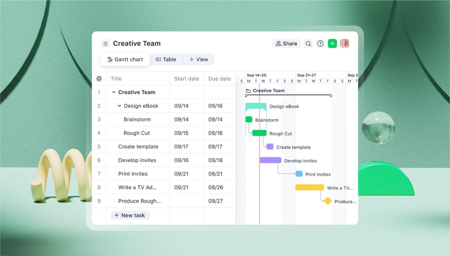
See sprint progress and project activity at a glance

Wrike workload chart displaying task assignments and individual capacity across the week
Wrike builds on this foundation with automated templates and tools that pull real-time task updates into your burndown chart, generate clear visualizations, and create reports you can share with teams and stakeholders. This ensures your charts stay current without extra manual work.In addition to burndown charts, Wrike gives teams a full view of workload and capacity. Workload and capacity planning tools help balance assignments, prevent burnouts, and keep sprints on track, so teams can see how effort, availability, and progress connect in one place.When you work in Wrike, you’ll also have access to a suite of features that enhance your sprint planning and streamline your entire project cycle, including:
- Live progress monitoring, pulled from all the platforms your team uses
- Automated progress updates to keep the whole team in the loop
- Shared team calendars to plan daily standups and coordinate work
- Capacity planning tools to balance workloads and prevent burnout
- Clear stakeholder communication with visuals and reports that show project status
- Agile templates for backlog management, sprint planning, and sprint retrospectives
Ready to create more dependable burndown charts? Use Wrike
Accurate burndown charts depend on reliable data and consistent updates. Wrike makes this easier by pulling real-time progress from your team’s work, so your charts always reflect what’s actually happening — not what was last manually recorded.
If you want a simpler way to build and maintain dependable burndown charts, Wrike’s Agile tools offer the visibility, automation, and structure needed to keep your projects moving forward with confidence. Start your free trial with Wrike today.
FAQs about burndown charts
What is the burndown chart?
A burndown chart is a project management visualization that tracks how much work remains over time. By comparing your team’s actual progress with an ideal trajectory, it helps you forecast completion, spot delays early, and keep your project or sprint on track.
What is burnup and burndown?
A burndown chart shows how much work is left to complete, while a burnup chart highlights how much work has been completed. Both compare real progress with an ideal pace, but burnup charts make scope changes easier to see because completed work rises over time as total scope appears as a separate line. Wrike supports both by visualizing remaining work, completed work, and evolving scope in real time.
When to use a burndown chart?
Use a burndown chart when you need a simple, visual way to track progress toward a fixed workload and deadline. They’re especially helpful in Agile sprints, project phases with clear deliverables, or any workflow where teams benefit from comparing planned versus actual progress to identify risks, blockers, or scope creep early.
What are some common burndown chart mistakes?
Common burndown chart mistakes include using the wrong measurement method, misinterpreting changes in remaining work, not accounting for work in progress (WIP), and outdated or inconsistent updates.
What does a good burndown chart look like?
A strong burndown chart clearly shows the ideal line, the actual effort line, and a consistent downward progression as work is completed. It should reflect accurate effort estimates, update reliably, account for scope changes, and make it easy to spot gaps between planned and actual progress. When automated through a tool like Wrike, a good burndown chart stays current without extra reporting effort.
Is a burndown chart Agile?
Yes — burndown charts are a core Agile tool used in Scrum to track sprint progress and team velocity. However, they’re equally valuable outside Agile for any project with defined work, deadlines, and the need for clear progress visibility.
How to create a burndown chart
To create a burndown chart: 1. Define the work and estimate effort (tasks, story points, or hours). 2. Set a timeline and draw your ideal line from total effort to zero. 3. Track daily progress by updating the remaining effort as tasks are completed. Tools like Wrike automate this process by pulling real-time work data into your chart.