Key takeaways:
- What is Wrike’s Chart view? It’s a new feature enhancing data analytics and visualization, making complex data analysis effortless.
- How does Chart view improve data access? It provides one-click access to deep insights, allowing users to slice and dice data easily.
- What kind of visualizations does Chart view offer? It includes various chart styles like Gantt charts, bar graphs, and funnel charts tailored for different analytical needs.
- Who can benefit from Chart view? It’s designed for diverse teams — marketing, IT, operations — fostering collaboration and efficiency in decision making.
- What are best practices for using Chart view? Use templates, customize widgets, create user-specific dashboards, and combine data for comprehensive insights.
The introduction of Wrike’s new Chart view marks a significant step in data analytics and visualization. This feature is a pivotal component of Wrike’s Next-Gen Analytics introduced at Collaborate 2023, designed to transform how teams analyze and interpret data.
More than just a visual enhancement, Chart view simplifies data analysis. It offers a one-click solution to access, slice, dice, filter, and break down data, enabling teams to gain deep insights effortlessly.
Why Chart view stands out: Elevating analytics in project and process management
Chart view revolutionizes how teams interact with data. It’s not just a visualization tool but a comprehensive analytics solution. The significance of Chart view lies in its simplicity and depth. With just a few clicks, teams can visually represent any aspect of their projects, from broad overviews to granular details. This flexibility is key in today’s diverse project environments, where adaptability and speed are important.
Chart view’s introduction comes when teams are increasingly distributed and diverse in their operations. The necessity for tools that bridge the gap between data and decision making, regardless of a team member’s location or role, has never been more evident. Wrike’s Chart view answers this call, delivering a seamless, intuitive experience that amplifies the collaborative potential of teams while anchoring them to the metrics that drive success. Here’s why Chart view is indispensable for modern project and process management.
Effortless data analysis
Chart view’s primary strength lies in its ability to make complex data analysis effortless. It allows users to access comprehensive data insights with a single click, bypassing the need for extensive data mining or analysis skills. This accessibility is crucial in fast-paced environments where quick decision making is vital. The user-friendly interface of Chart view ensures that all team members, regardless of their technical expertise, can benefit from its analytical capabilities.
Integrated visualization and analytics
The true power of Chart view is its integrated approach to visualization and analytics. It offers a variety of chart styles to represent data, each providing unique insights. Whether it’s a chart showing the distribution of resources or a bar graph tracking project milestones, Chart view transforms raw data into meaningful visual narratives. These analytical insights are vital for identifying trends, forecasting outcomes, and making data-driven decisions.
Simplified interaction with complex data
Chart view simplifies the interaction with complex datasets. It offers intuitive tools for slicing and dicing data, making it easier to manage and interpret. Users can dynamically filter and dissect data, enabling them to identify underlying trends and patterns that might otherwise go unnoticed. This capability is particularly beneficial for teams dealing with large and multifaceted datasets.
Versatility across teams and projects
Chart view is designed to be adaptable, catering to a wide range of team needs and project types. It’s as effective for a marketing team analyzing campaign performance as it is for a project manager overseeing a construction project. The real-time insights provided by Chart view enable teams to adapt their strategies, ensuring that they are always aligned with current data and trends.
Easy to use yet powerful
The beauty of Chart view lies in its simplicity. It does not require users to have advanced data analytics skills, thereby democratizing data analysis across the organization. Its seamless integration into the existing Wrike ecosystem enhances the overall user experience, making it a natural part of the workflow.
Key features
- One-click data analysis: Access deep insights instantly without complex data processing
- User-friendly interface: Intuitive design that caters to all skill levels, making data analytics accessible to everyone
- Adaptable visualizations: Variety of chart styles to suit different data types and analysis needs
- Real-time data insights: Immediate visibility into project and operational metrics for swift decision making
- Seamless integration: Integrates with existing Wrike features, enhancing productivity and user experience
- Comprehensive reporting: Teams can report on various items, including tasks and projects; custom item types like campaigns, service tickets, and bug fixes; and leverage custom fields as metrics and parameters for in-depth analysis
Empowering project management teams with Chart view
The introduction of Wrike’s new Chart view heralds a transformative approach to overseeing complex projects. This innovative feature offers project managers a visually intuitive, data-rich canvas for real-time tracking and analysis, turning raw data into actionable insights.

Dynamic visualization for project milestones
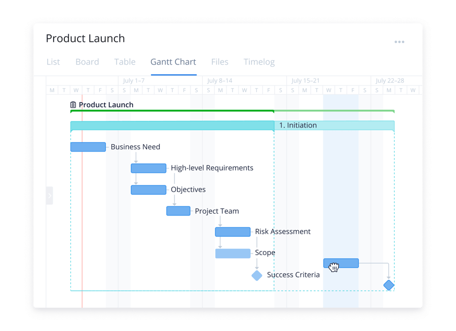
The visualization of project milestones is critical. Chart view elevates this process with color-coded Gantt chart timeline. These charts provide a visual project timeline, highlighting key milestones and their statuses. The color coding makes distinguishing between completed, pending, and at-risk milestones easy. This immediate visual insight aids project managers in quickly identifying areas that need attention, ensuring that projects stay on track.
Resource management visualization
Effective resource management is vital for the success of any project. Chart view supports this by visually representing individual and team workloads. Using charts, project managers can see how tasks are distributed among team members. This visualization helps identify overburdened employees and underutilized resources, enabling managers to redistribute tasks for a more balanced workload. This helps maintain project timelines and plays a key role in preventing employee burnout and ensuring team morale.
Financial tracking with Chart view
Financial oversight is another crucial aspect of project management. Chart view aids financial controllers and project managers by providing real-time financial data through bar graphs. These graphs can track spending against project budgets, offering immediate visibility into financial performance. If a project is nearing or exceeding its budget, the visual cues from Chart view enable quick identification and corrective actions, such as reallocating funds or reducing expenditures, to keep the project financially on track.
Adapting to Agile methodologies
For teams that employ Agile methodologies, Chart view is an indispensable tool for sprint planning and retrospectives. It provides a visual backlog that can be used to prioritize tasks, track sprint progress, and review team velocity. Agile teams can thus maintain high adaptability and continuous improvement, which is essential to the methodology’s success.
Optimizing sales performance with Chart view
Wrike’s Chart view is an invaluable analytical asset for the sales team. It is crucial in refining sales strategies and ensuring operational excellence by empowering sales professionals to easily visualize, analyze, and draw insights from their data. As part of Wrike’s Next-Gen Analytics, it embodies the future of intuitive, effective sales data analysis.

Pipeline analysis
The sales team can use Chart view’s funnel charts to gain tangible insights into the different stages of the sales pipeline. These charts visually represent prospects’ journey from initial contact to closing. By analyzing the funnel, sales professionals can identify stages where prospects are dropping off, enabling them to refine their sales strategies for better conversion rates.
Performance tracking
Chart view’s line graphs are essential for tracking sales performance against targets. This feature allows sales managers to set visual benchmarks and compare them against the team’s actual achievements. It’s a useful tool for accurate forecasting, trend spotting, and strategic adjustments, ensuring that the team remains on track to meet or exceed sales quotas.
Geographical sales data representation
The geographical representation of sales data is another key area where Chart view shines. Charts can display sales broken down by region, offering strategic insights into market performance. This visualization helps managers allocate resources more effectively and tailor regional sales strategies based on the performance of specific areas.
With Chart view, sales teams can:
- Use funnel charts for a comprehensive sales pipeline view, identifying stages requiring strategy tweaks
- Use line graphs to clearly compare set targets against actual sales achievements, aiding in performance evaluation and forecasting
- Show sales distribution across regions, assisting in strategic planning and resource allocation using charts
- Use data analysis to compare current data with historical trends, identifying patterns and areas of improvement
Streamlining operations with Chart view
The quest for peak efficiency is an ongoing journey. Wrike’s Chart view is a transformational feature that brings clarity and precision to this quest, enabling teams to visualize and analyze their operational workflows and performance metrics in real time.

Process efficiency analysis
One of the primary uses of Chart view for the operations team is to analyze and optimize workflows. By visually mapping out processes, Chart view provides an immediate understanding of the entire workflow, helping teams to pinpoint bottlenecks or redundancies quickly. This visualization is key for continuous improvement efforts, allowing operations teams to streamline processes for maximum efficiency.
Load and progress monitoring
Chart view enables operations teams to monitor workload and progress through bar and line charts. This feature is especially useful in managing day-to-day operations, providing teams with a clear view of ongoing activities. Operations managers can track the progress of various tasks, monitor overall workload, and ensure that resources are used effectively, leading to a smoother operational flow and enhanced productivity.
Performance and gap analysis
Understanding and improving operational performance is vital. Chart view assists in this by enabling the identification of trends and gaps in operational processes. With the capability to analyze data representations side by side and delve into historical data, Chart view is a powerful tool for uncovering patterns and gaps that might otherwise go unnoticed. This feature aids in making informed decisions to bridge these gaps and optimize performance.
Elevating marketing strategies with Chart view
Wrike’s Chart view is also an indispensable feature for the marketing team, going far beyond basic visualization. It provides a comprehensive, user-friendly platform for analyzing complex marketing data required for strategic planning and campaign optimization. As part of Wrike’s Next-Gen Analytics, Chart view empowers marketing professionals to leverage data for smarter, more effective marketing decisions, aligning perfectly with the modern marketer’s need for data-driven strategies.

Campaign performance metrics
Marketing teams need to track and analyze campaign performance in real time. Wrike’s Chart view excels in this area by offering interactive bar and line charts that display key performance indicators (KPIs) such as click-through rates, engagement levels, and conversion metrics. This real-time visualization of campaign data allows marketing teams to quickly identify successful strategies and areas needing improvement, enabling them to adjust their campaigns dynamically in response to performance data.
Budget allocation analysis
Effective management of marketing budgets is essential for maximizing return on investment (ROI). Chart view’s charts provide a granular breakdown of marketing spend across various campaigns and channels. This visual tool allows marketing professionals to see precisely where their budget is being allocated and make real-time adjustments to ensure funds are being spent most effectively.
Content performance tracking
In the realm of marketing, content is king. Chart view aids in analyzing which types of content are performing best. It allows teams to track views, shares, and engagement metrics across various content types, providing valuable insights into content effectiveness. This data is critical in planning future content strategies, focusing on creating content that resonates with the target audience.
Maximizing IT and development efficiency with Chart view
Wrike’s Chart view provides IT and development teams with a versatile way of managing complex projects, tracking progress, and analyzing results through a clear, visual interface. Agile methodologies hinge on adaptability and continuous improvement. With Chart view, sprint planning becomes a visual exercise where teams can map out iterations using bar or line charts to track completion rates against time. It allows for quick adjustments based on velocity and backlog size, ensuring realistic sprints and goals are met.

One of the biggest aspects of development is bug tracking. Chart view can display the status of bugs through charts or heatmaps, highlighting areas that need immediate attention. This enables IT teams to prioritize bug fixes based on severity and frequency, reducing downtime and improving product quality. Chart view can also illustrate performance metrics like response times, server load, and throughput across different times and conditions. This real-time data visualization helps teams anticipate and mitigate potential bottlenecks, ensuring systems remain robust under varying loads.
Best practices for Chart view
To get the most out of Chart view, consider the following best practices:
- Use pre-configured templates and widgets to start visualizing data immediately
- Customize fields within widgets, including custom fields, for tailored insights
- Leverage the “current user” filter to create dynamic, user-specific dashboards
- Combine data from multiple sources for a holistic view of project landscapes
Wrike’s Chart view is more than just a feature; it’s a strategic advantage in project management. By offering extensive use cases and best practices, Chart view is invaluable for any team looking to enhance their project insight and management.