

Half of project teams have no access to real-time KPIs, yet spend at least one full day each month manually pulling together status reports, according to Wellingtone’s State of Project Management Report. That’s a day’s work producing information that’s already out of date by the time anyone reads it.
Kanban metrics are measurable indicators that show how efficiently work moves through a process. How fast does work flow? Where does it slow down? How predictable is our delivery?
When used well, these metrics help teams spot bottlenecks before they compound, forecast delivery dates with real data instead of gut feel, and build the kind of consistency that makes planning reliable. That applies whether we’re managing a software team, a marketing operation, or any process where work moves through defined stages.
In this guide, we cover each key Kanban metric with a clear definition, a concrete example, and the exact steps to track it in Wrike. By the end, we’ll have a practical framework for reading our system and improving it.
Types of Kanban metrics
Not all Kanban metrics work the same way, and mixing them up leads to misreading your system. There are a few distinctions worth knowing before we get into the specific numbers. The main Kanban metrics and important Kanban metrics, such as cycle time, lead time, throughput, and work in progress, are essential for workflow analysis and improving project predictability.
The first is flow vs. outcome metrics. Flow metrics tell us how work moves through the system: speed, volume, and age. Outcome metrics tell us what the system actually produces: delivered value, defect rates, customer impact. Both matter, but they answer different questions. A team can have fast flow and still ship the wrong things.
The second is leading vs. lagging indicators. Leading indicators signal what’s about to happen. If the work in progress is climbing, the cycle time will follow. Lagging indicators confirm what already happened: throughput last month, deployment frequency last quarter. We need both.
Leading indicators help us course-correct in real time; lagging ones validate whether the changes we made actually worked. These metrics serve as navigational tools to inform decisions about resource allocation and project timelines.
The third is the team vs. organizational perspective. A team might optimize their board perfectly while the broader system remains broken, like handoffs between teams, approval queues, and dependencies. Some metrics only make sense at the team level; others require zooming out to the portfolio or program.
Here’s how the key metrics map across those dimensions:
Metric | Examples | What it measures |
3 days from start to done | How long one item takes to complete from start to finish | |
8 days from request to deploy; 2-week bug fix average | Total time from commitment to delivery, including wait time before work begins | |
Throughput | 12 items done last week; 40 tasks closed this sprint | How many items we complete in a set time period |
Work in progress (WIP) | 7 active tasks; WIP limit of 5 per person | Items started but not finished; the primary driver of slow cycle times |
Flow efficiency | 2 days active work out of 10 elapsed = 20% | Ratio of active work time to total elapsed time (most teams run at 10 to 20%) |
Let’s dive into the specifics of each metric.
Lead time metrics
Every team has that one ticket nobody talks about. It was filed six weeks ago, it’s been “in progress” for three, and somehow it never comes up in standup. Lead time is the metric that makes that ticket impossible to ignore.
Lead time measures the total time from when we commit to a piece of work until it’s delivered. It starts the moment a request enters our system, before anyone has touched it, and ends when it ships. That’s what makes it different from cycle time, which only counts the time a team is actively working on an item.
The formula is simple:
Lead time = delivery date – request date
If a task was logged on Monday and shipped on Friday, the lead time is five days, regardless of how many hours were actually spent on it. Cycle time for that same task might be two days if it sat in a queue for three.
Monitoring lead time and cycle time can help improve forecasting and set realistic deadlines for project completion.
Service-level expectations and percentile analysis
A service-level expectation (SLE) is a public commitment about lead time based on historical data. Instead of saying “We’ll get to that in about a week,” we say “85% of items like this are delivered within 12 days.” This creates a data-backed probability statement, which is more useful than a promise we invented.
Looking at lead time distribution helps here too, because it shows whether delivery is fairly consistent or stretched by a long tail of slower items.
To set an SLE, we examine our lead-time distribution and select a percentile target. The 85th percentile is the most common choice because it covers the bulk of realistic outcomes without being thrown off by outliers. If our 85th percentile is 12 days, that means 85 out of 100 items historically finished in 12 days or fewer.
We use percentiles rather than averages because averages are sensitive to outliers. One 40-day item can shift the average by days. Percentiles don’t move unless the shape of the whole distribution changes, making them far more stable for forecasting.
Throughput metrics
Ask most managers how much their team can deliver in a month, and they’ll give you an estimate. Ask them to show you the data behind it, and you might hear crickets.
Kanban throughput is the number of work items we complete per unit of time. It doesn’t measure effort or hours. It doesn’t ask how hard we worked. It asks one question: how much did we finish?
A team that completes eight items per week has a throughput of eight, regardless of whether those items took two hours or two days each. Throughput treats the team as a system and measures output rather than activity.
Throughput trends
A rolling average smooths the week-to-week noise and shows the trend underneath. If a four-week rolling average is climbing, the system is improving. If it’s flat or falling despite the team working harder, the bottleneck is structural, and effort alone won’t fix it.
A histogram analysis helps show whether throughput is fairly steady or swings from week to week over time.
Throughput trends also reveal the impact of changes. If we reduced WIP limits in week six, did throughput go up two weeks later? If we added a team member in week nine, would that be reflected in the numbers? Without the trend, we can’t tell whether our interventions worked.
Capacity planning
Capacity planning is the process of matching the work we take on to the work we can actually finish. In Kanban, it means using throughput data to set realistic intake limits and delivery commitments, rather than filling the backlog based on what stakeholders want and hoping the team keeps up.
Throughput is the only reliable input. We should never commit to a delivery date based solely on estimates. Instead, take the last eight to twelve weeks of throughput data, calculate the range we operate in, and use that range to answer the question: given X items remaining, when are we likely to finish?
A team delivering between eight and 14 items per week, with a backlog of 40 items, will finish in roughly three to five weeks.
Work in progress (WIP) metrics
There’s a version of busyness that looks like productivity but isn’t. Everyone has something active. Standups are long because there’s so much to cover, and yet, things just aren’t shipping. That’s a WIP problem, and it’s more common than most teams want to admit.
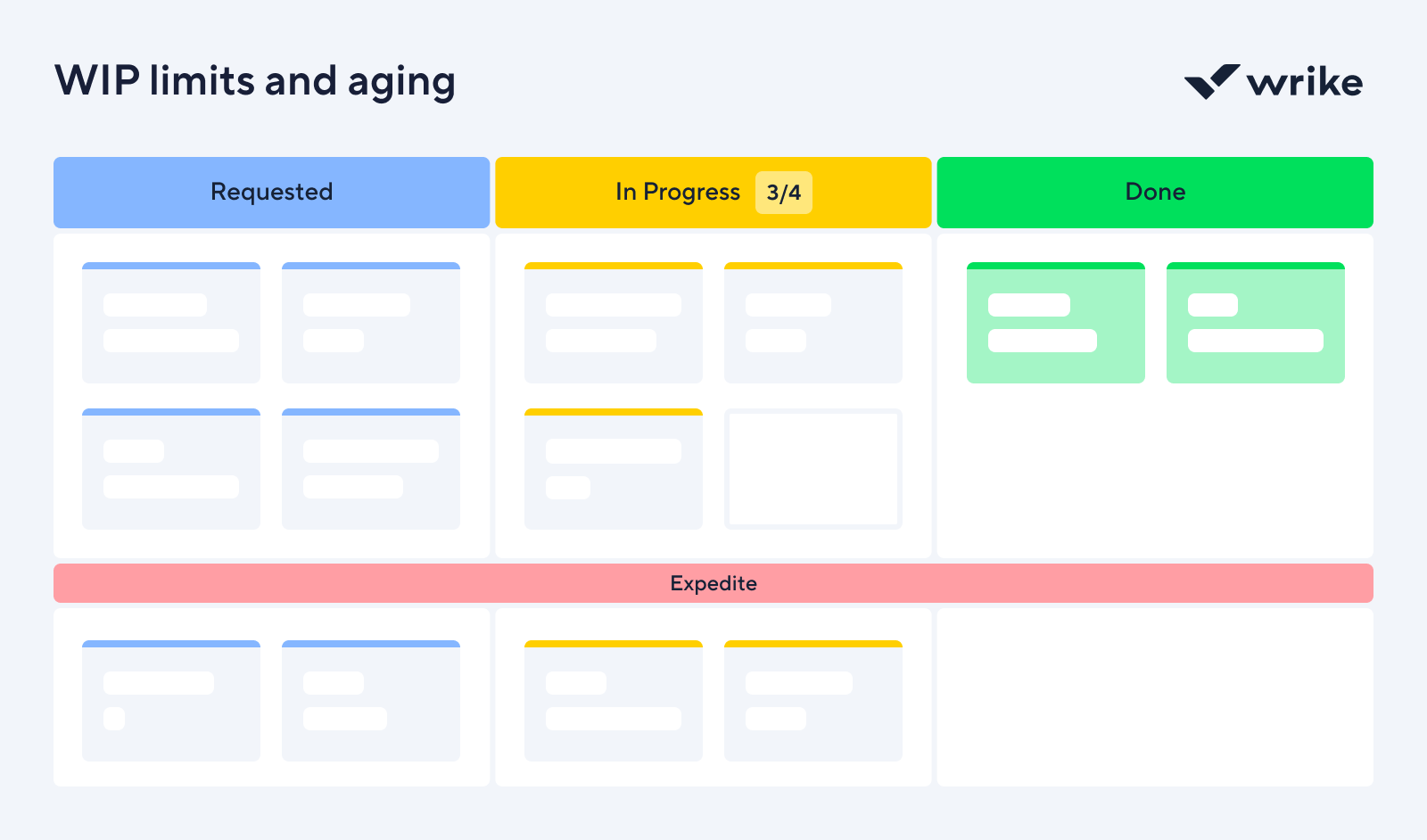
In Kanban, WIP limits are explicit caps on the number of items that can sit in any given column at once. When a column reaches its limit, the team stops pulling new work. Full stop. The rule exists because starting work and finishing work are not the same thing, and most teams are far better at the former than the latter.
Little’s Law
The relationship between WIP and cycle time isn’t intuitive until you see it written out. Little’s Law states:
Cycle time = WIP / Throughput
If our team completes 10 items per week and we have 30 items in progress, our average cycle time is three weeks. If we cut WIP to 20, cycle time drops to two weeks — without anyone working harder or faster. The math is exact, and it holds for any stable system.
This is why WIP limits work. They’re not about restricting the team. They’re about protecting cycle time by keeping the denominator of that equation from ballooning.
WIP limits and aging
A WIP limit is a cap on how many items can occupy a given stage at once, while aging WIP is what happens when limits aren’t set or enforced. Items accumulate in columns, stay open for days past their expected duration, and gradually become invisible.
Tracking WIP over time tells us whether the system is getting healthier or accumulating debt. If WIP is climbing week over week, work is entering faster than it’s leaving.
Flow efficiency metrics
Flow efficiency is a number most teams have never calculated, and almost no one wants to see once they do. Here, you take any work item and count the hours someone was actively working on it. Then count the total hours it was open. Divide the first by the second. For most teams, that number sits somewhere between 10% and 20%. The other 80% is how long the task was waiting.
Flow efficiency is the ratio of active work time to total elapsed time, expressed as a percentage:
Flow efficiency = Active time / Total elapsed time x 100
A task that took two days of actual work but sat open for 10 days has a flow efficiency of 20%. The remaining eight days were spent in a queue, waiting for a review, a decision, or someone to notice it existed. That wait time isn’t neutral. It inflates lead time, creates uncertainty, and makes forecasting harder than it needs to be.
Wait time and waste
Wait times usually fall into four predictable categories:
- Queue wait is the time an item spends between stages, technically done with one step but not yet picked up for the next.
- Handoff wait happens when work moves between people or teams and sits until someone claims it.
- Approval wait is exactly what it sounds like. A task completed in every practical sense, stalled because a decision hasn’t been made.
- Rework wait is the costly one. It’s the work that was done, reviewed, rejected, and now sits idle while someone finds time to fix it.
None of these show up as obvious failures on a Kanban board.
Example
For example, let’s say a content team tracking flow efficiency found that articles spent an average of six days in legal review, but legal was only actively reviewing them for about two hours.
The bottleneck was that requests arrived unannounced and were added to an invisible queue. The fix was a shared intake calendar, where writers scheduled review slots a week in advance, and legal blocked the time. Flow efficiency on that stage went from 4% to 35%.
Advanced visualization and analysis tools
A well-built dashboard tells us what’s happening right now, and whether we should be worried.
Real-time dashboards
Wrike’s dashboards get teams up and running quickly with a selection of predefined dashboards that deliver real-time reports without setup overhead. From there, every dashboard is fully customizable, with widgets that can be tailored to reflect the team’s specific objectives, including calendar and chart views, custom fields, defined filters, and additional data sources.
Key information sits side by side for easy comparison. Trends can be viewed by month, quarter, or year, and each view updates in real time as work moves through the board. Teams can establish different criteria, add exceptions, and choose how to surface findings in pie charts, bar graphs, donut charts, and more.
Reports
Most teams spend more time assembling reports than reading them. Reports in Wrike are fully customizable and built around your criteria, and every time you open or refresh one, it automatically pulls the most current data that meets those criteria. No manual updates or stale numbers (phew!)
Things Wrike reports do that matter for Kanban specifically:
- They save time. Because reports refresh automatically, the weekly reporting burden disappears. The data is up to date whenever someone opens it.
- They give big-picture visibility. A single report can pull across multiple projects and teams at once, so we’re not stitching together individual board views to get an org-wide read on throughput or cycle time.
- They surface the right problems. Reports show what’s past due, what’s blocked, and where handoffs are breaking down.
Reports can also leverage cycle time histograms and burn-up charts to visualize workflow trends, track user stories, and monitor progress. These visual tools help teams analyze workflow efficiency, measure cycle times, and identify bottlenecks.
Automations
Wrike’s automation lets teams define triggers and actions across workflows, projects, or custom item types, scoped to a single location or applied across the whole workspace. For Kanban metric tracking, that means the system enforces the data hygiene required for the numbers to be accurate, rather than relying on people to do it manually.
Wrike AI adds another helpful layer, making smart automation suggestions based on repetitive activity patterns it observes in your team’s workflow. Rather than building every rule from scratch, the system identifies where automation would help and proposes it. For teams new to Kanban metrics, that’s a faster path to clean data than manual rule-building.
Metrics dashboard design
A good dashboard is a decision-making tool. It should present comprehensive metrics that enable teams to analyze their Kanban process and identify bottlenecks and inefficiencies for continuous improvement. Which numbers sit at the top, how fresh the data is, and what gets visual weight determine whether your team acts on it or ignores it.
Effective dashboards leverage data analysis to support informed decision-making and optimize workflow performance.
Which KPIs go first
Most teams have access to dozens of metrics. The ones that belong at the top are the three or four KPIs that actually move decisions. For project tracking, we keep the primary row to schedule variance, budget burn rate, and open blockers. If a metric doesn’t change what someone does that day, it doesn’t belong in the primary view.
Data refresh frequency
We tier refresh rates by decision cycle. Operational metrics refresh every few hours. Financial metrics like burn rate — update daily. Strategic indicators, milestone progress, and risk ratings — update weekly. Document the cadence near each metric on the dashboard itself, not in a footer no one reads.
Visual hierarchy
Reserve the top of the dashboard for status: on track, at risk, off track. Trend lines and comparisons sit below. Granular detail, task breakdowns, and dependency lists live in a secondary view. Color signals state, not brand. The moment green and red become decorative, they stop being useful.
Audience-specific views
Team leads need task-level granularity. Project managers need to schedule and budget health across the full team. Executives need one screen that answers whether the project is on track. Same underlying data, three filters. Build the views separately, or people will ignore the dashboard entirely.
Connecting metrics to business outcomes
Kanban metrics only matter if they connect to something a business cares about. The business implications break down across four areas:
- Value delivery: Every day a feature sits undelivered is a day it isn’t generating revenue or solving a customer problem. Cutting the average lead time from 15 days to eight doubles the pace at which value reaches customers.
- Customer satisfaction: Customers don’t experience WIP counts or flow efficiency percentages; instead, they experience whether we delivered what we said we would, when we said we would. A team consistently hitting its SLE builds reliability.
- Cost of delay: Every item waiting in the system has an economic cost. A pricing change that recovers $50,000 per month costs $12,500 per week it stays unshipped. Aging WIP and queue length metrics make that visible before it compounds.
- Strategic planning: Throughput and predictability data answer questions like how many initiatives we can run in parallel, which team is the bottleneck, and where the constraint moves if we add capacity.
Continuous improvement is facilitated by analyzing Kanban metrics over time, and effective use of these metrics can enhance customer satisfaction by ensuring the timely delivery of quality products.
Improve projects with Kanban metrics in Wrike
Kanban metrics shift the conversation from how busy we are to how well work actually flows. Cycle time, lead time, throughput, WIP limits, flow efficiency, and delivery predictability each reveal a different part of the same system, giving teams the transparency to see what’s happening and the data to act on it.
Wrike’s Kanban boards, dashboards, reports, and automation handle data collection and surfacing, but the harder part is building the discipline to regularly review the numbers and act on what they show. Teams that do that consistently deliver more predictably, build more trust, and spend less time firefighting their processes.