Key takeaways:
- What is a cumulative flow diagram? This is a visual tool used with Kanban boards to illustrate team tasks over time, indicating key metrics like cycle time, throughput, and work in progress.
- How do you identify bottlenecks? Look for sudden jumps or dips in the diagram, indicating process issues that need attention.
- What does narrowing of bands signify? Indicates that your team has excess capacity, allowing for resource reallocation.
- What does widening of bands signify? This suggests an influx of tasks greater than completions, necessitating adjustments in capacity and workload.
- Why should anybody use cumulative flow diagrams? They facilitate process improvement by providing a clear visual understanding of workflow efficiency and project status.
You want your team to work as efficiently and effectively as possible, but it can be challenging to get a handle on how things are really going. A cumulative flow diagram is a visual way for you to understand your team’s work processes so that you can figure out how it can be improved.
Is there a bottleneck in your process that you aren’t aware of? Are people buried under too much work? Could your capacity and resource planning use some work? Discover how to use and read a cumulative flow diagram to get rid of these project obstacles.
What is a cumulative flow diagram?
A cumulative flow diagram is a data visualization tool that works with a Kanban board. The horizontal axis represents a time period and the vertical axis represents your team’s items or tasks.
The diagram accumulates every task from each column on your board and pulls it into the chart so you can see the following metrics:
- Cycle time: How long it takes a task to get through your process
- Throughput: How much work your team delivers in a designated time period
- Work in progress: What your team is actively working on
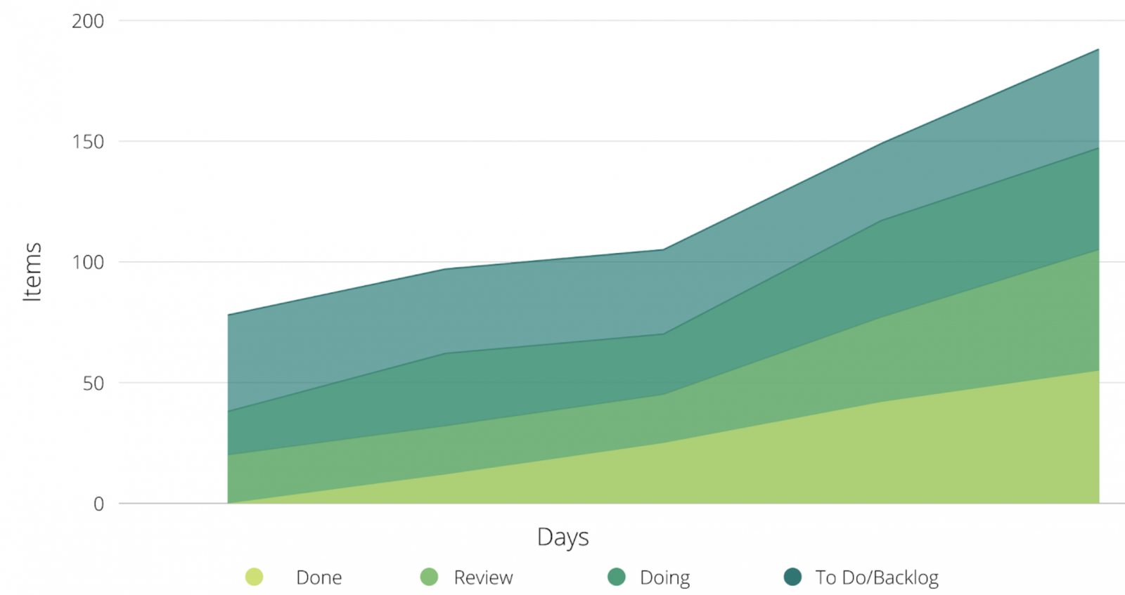
Let’s look at a simple example. Perhaps your team is working off of a Kanban planner for your website redesign. Here’s what a cumulative flow diagram could potentially look like as more tasks are added to each column. You can see that each column of your board (doing, review, done, and to do/backlog) is represented on the chart:
Kanban boards are an Agile project management tool, which means cumulative flow diagrams are particularly popular for Agile teams. You might even hear them referred to as Agile cumulative flow diagrams.
However, these diagrams can be used in project management across a variety of teams and projects. If you use a Kanban board, you can also use a cumulative flow diagram.
What can you use cumulative flow diagrams for?
A cumulative flow diagram’s job is to make it easy for your team to spot when something in your process or project isn’t working correctly. Ideally, all of the sections of your diagram should be rising smoothly together — almost parallel with one another. If you see a sudden jump or dip, that indicates an issue with your process.
Cumulative flow diagrams are a powerful visualization tool that makes it easy for your team to:
- Understand exactly where in your process a problem or bottleneck is occurring (because that’s where you’ll see that jolt on the diagram)
- Manage your team’s capacity and identify where you can increase or reduce workload
- Monitor progress by seeing much work your team has in progress
They’re a great way to go beyond your Kanban board with a visual representation. But, knowing how to read a cumulative flow diagram can take a little bit of practice.
How to read a cumulative flow diagram
So, let’s talk about how you can effectively interpret what’s being shown on your diagram. Keep in mind that what you want to see is all of the bands rising together somewhat smoothly (like what our example above showed).
This means that new tasks are coming into your workflow at about the same pace as tasks are being completed. Your team is working like a well-oiled machine.
However, maybe your graph isn’t quite so smooth. Instead, you could see one of the following scenarios:
Narrowing of your bands
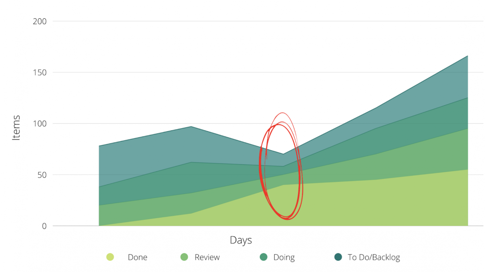
Here’s what it can look like when the bands on your cumulative flow diagram suddenly narrow and come closer together: 
What this means: Your throughput (remember, that’s the amount of work your team is completing and delivering) is significantly higher than the number of tasks entering your workflow. Take this as a sign that your team has more capacity at that stage than you thought, meaning you can reduce your team capacity in that phase and allocate it elsewhere.
Widening of your bands
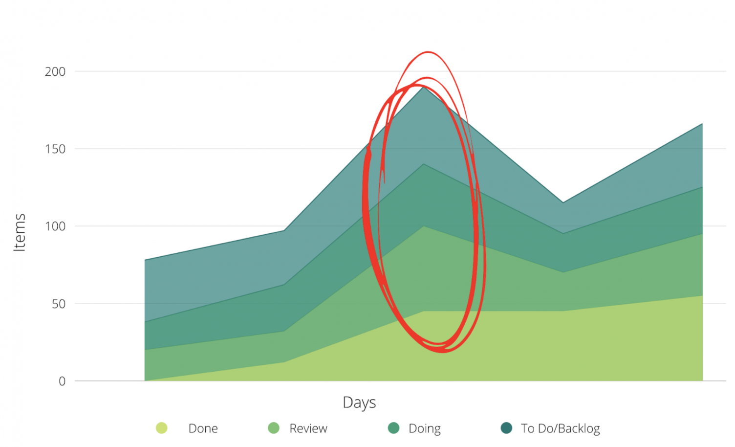
Here’s what it might look like when the bands on your cumulative flow diagram expand and widen together:

What this means: You have more cards or tasks entering that phase than ones that are being completed and leaving that phase. You’ll need to adjust your capacity and process so that your team is able to complete tasks, rather than piling their plate full with even more to get done.
What are the benefits of using a cumulative flow diagram in project management?
From effectively managing your team’s workload and capacity to keeping a close eye on progress, a cumulative flow diagram has a number of applications for projects and teams.
However, if we had to pinpoint the biggest benefit of a cumulative flow diagram for project management, it’s this: process improvement.
As the above examples demonstrate, this diagram makes it easy to tell how your process and workflow is running with a single glance. It’s an immediate indicator of whether things are going smoothly, or you need to make some adjustments.
This objective view is undeniably important. When 21.6% of top and middle managers think that their processes are handled better than their direct reports do, this diagram allows them to get a real understanding of how project processes are working — rather than operating with assumptions and blind optimism.
Can you use cumulative flow diagrams in Wrike?
In addition to building a Kanban board directly within Wrike, you can also create a work progress chart which also gives deep insights into work statuses and productivity. Here are the simple steps to make it happen:
- Navigate to your performance analytics view within Wrike.
- Click “Add Chart” at the top.
- Select “work progress” from the options for the type of chart you can create.
- Click “Create.”
- Customize your chart.
- Name your chart in the field at the top.
- Click “Save Report.”
Just like that — you have an intuitive peek into the work your team is doing. Use that information to improve your processes and support your team in getting even more high-quality work across the finish line. Ready to get started? Sign up for your free trial of Wrike today.


